Since the start of the COVID-19 pandemic, spatial data and tools have been widely used to track and visualise the virus globally. Mapping such a vast and dynamic outbreak can be challenging. The Johns Hopkins ArcGIS Dashboard is a widely used tool to understand the spread of the disease. News articles, reports and studies are nearly always accompanied by a map.
Social media allows these maps to be shared at an incredible pace. Although maps are a fantastic tool to show the “where”, sometimes map data can be misleading and so it’s critical that cartographers present information carefully. In this blog we discuss a few obvious COVID-19 cartographic errors and how they could have been improved.
Thou shall not compare area totals
The global scale of this disease mean comparisons between neighbouring countries and regions are inevitable. However, comparing total counts can be misleading due to differences in population. In the social media post below, the John Hopkins ‘Cumulative Cases’ map has been taken out of context (legend hidden). The author is comparing US county cases with Canadian provinces. However, the more localised US data makes the map appear redder as the population will be different between regions.

A more appropriate approach to understand the impact of COVID-19 between areas would be to normalise cases by population. An incident rate (cases per 100,000 persons) allows fairer comparisons between areas. The maps below show the difference between cumulative cases and incident rate. It’s clear there are many cases south of the border even when considering population!

Choose colour schemes wisely
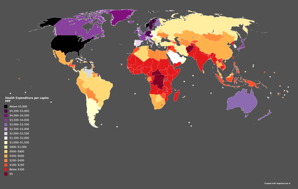
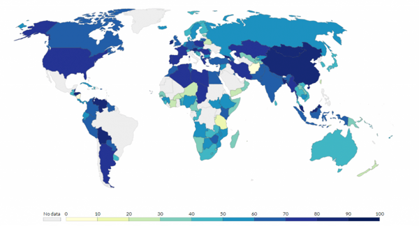
When using a thematic map to display quantitative data like COVID-19 cases, a colour progression should be used to depict the data properly. Using highly contrasting colours should be reserved for qualitative data (such as religion type). Using a single or blended hue allows viewers to recognise quantity more easily. This is due to our cognitive ability to compare visually.
It’s difficult to depict progression in quantities clearly for the map below, which uses dark colours at each end of the colour range.

In comparison, colour schemes used in the map below displays a clear progression in values and the data makes sense visually.

The chronicity problem
Representing time on a map is difficult. Many of the COVID-19 dashboards and maps provide information on cumulative cases, instead of active cases. Cumulative maps show the outbreak as always worsening, even though it may not be the case. Proportional symbology or overlapping points will continue to grow creating a messy and overcrowded map. Other visualisations like charts or an animated time-series can more clearly show a progression over time.
Showing only daily or new counts is a better way to more realistically represent the current scenario. In the map below, a clear and neat map shows the daily cases and deaths per country. This map allows you to view cases on a single date and can animate over time. The slider on the bottom left lets you select a date.

Mapping responsibly
We live in an era where there are a vast number of visualisations on important global topics such as COVID-19. People tend to believe maps especially if they come from a trustworthy source. When designing a map, context plays an important role and more often than not, the simpler the map the better.
The key to providing information is to know your data well and pick a technique that supports the telling of that story. There is no one formula to make a great map. It takes many iterations to get the story telling and visual appeal right.
For more information on cartography and ArcGIS Dashboards contact our Location Solutions team.


 Cartography fails for COVID maps" style="object-fit: cover;object-position: center;width:100%;height:100%;" fetchpriority="high" decoding="sync"/>
